
LOGO DESIGN • BRANDING
A Modern Brand Refresh for a Pittsburgh IT Leader
Wolf Consulting needed a more modern identity that reflected the company’s expertise in IT support, cloud services, and business technology solutions. Prizum refreshed the brand to preserve its legacy while creating a cleaner, more versatile visual system built for today’s market.
THE CHALLENGE
An Outdated Identity That No Longer Fit
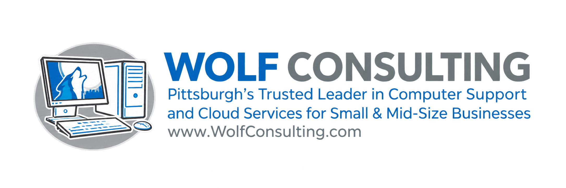
Wolf Consulting’s previous brand had served the company for years, but it no longer reflected the forward-looking nature of the business. The computer illustration in the original logo made the brand feel dated and less aligned with the modern IT services market.
The goal was not to abandon the company’s history, but to evolve the brand into something more current, credible, and flexible across today’s business touchpoints.
THE SOLUTION
Modernize the Brand While Preserving Its Legacy
The refresh began with research into Wolf Consulting’s competitive landscape and other IT-focused brand identities. That process helped define opportunities for differentiation while reinforcing the company’s positioning as a leader in Pittsburgh IT solutions.
A key strategic decision was to preserve the “Wolf” legacy from the original identity. Rather than removing that familiar symbol, Prizum reimagined it into a cleaner, more modern mark integrated directly into the logo.
Positioning
Position Wolf Consulting as a leader in Pittsburgh IT solutions.
Brand Legacy
Preserve the legacy of the original name and wolf symbol while modernizing its presentation.
Creative Direction
Create a brighter, cleaner, and more modern identity that feels credible, professional, and current.
THE DESIGN
A Stronger, More Versatile Identity
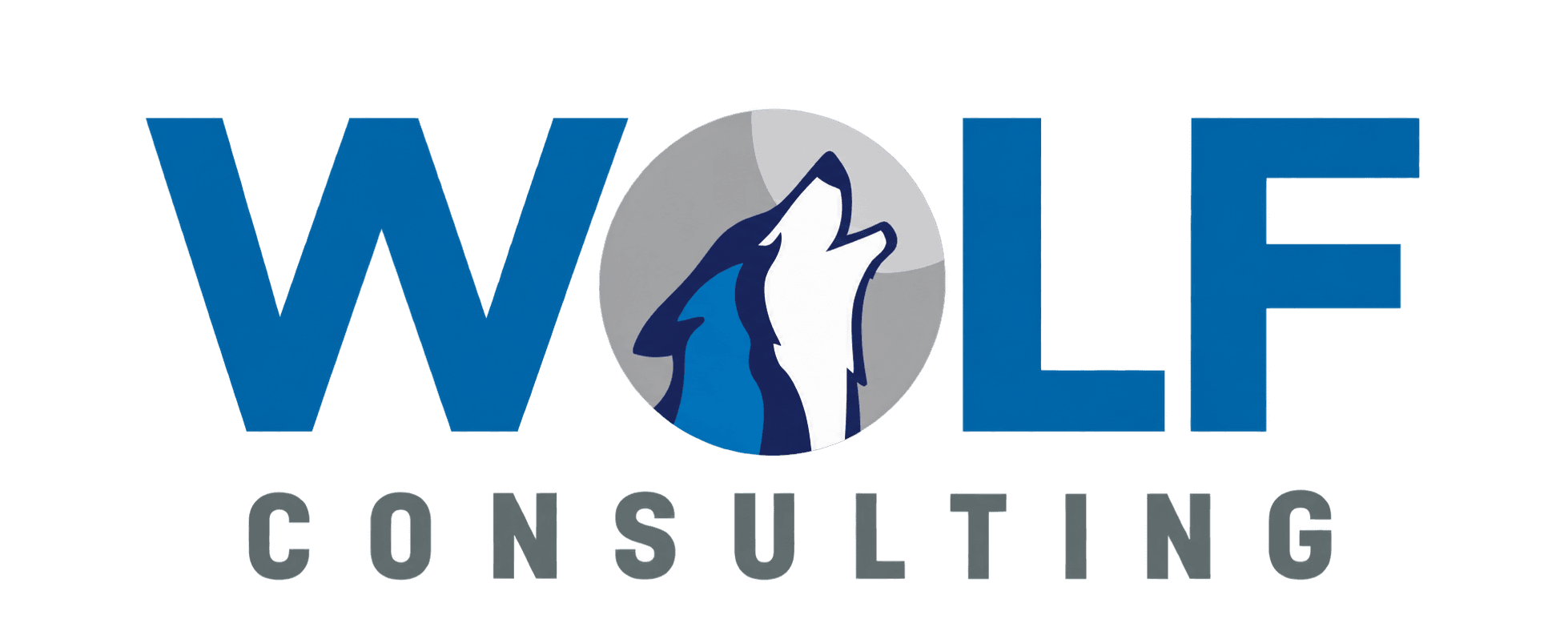
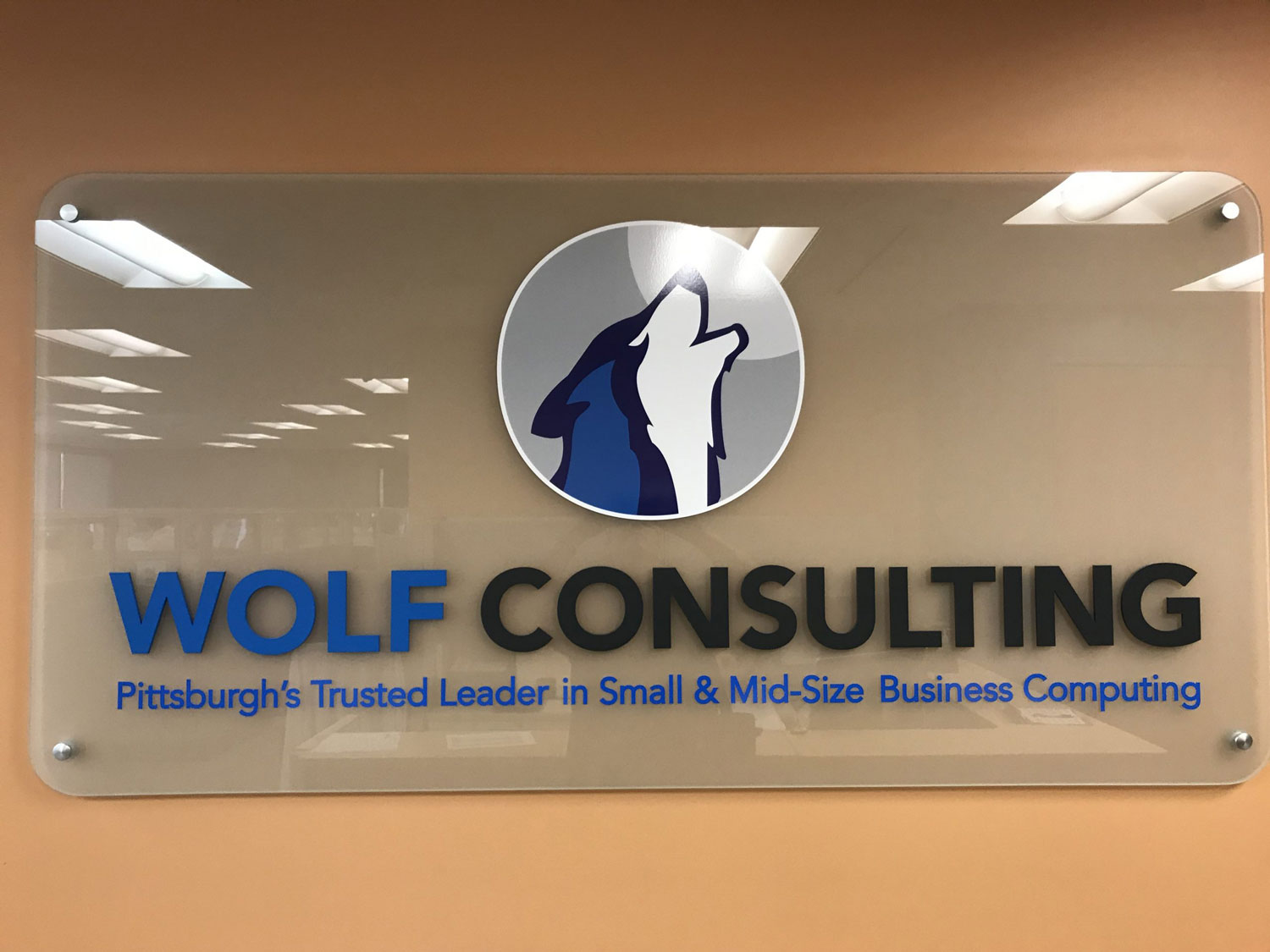
Prizum developed a refreshed visual identity centered around a modernized Wolf mark. The new logo keeps the company’s recognizable wolf concept, but simplifies and refines it into a more professional, contemporary form.
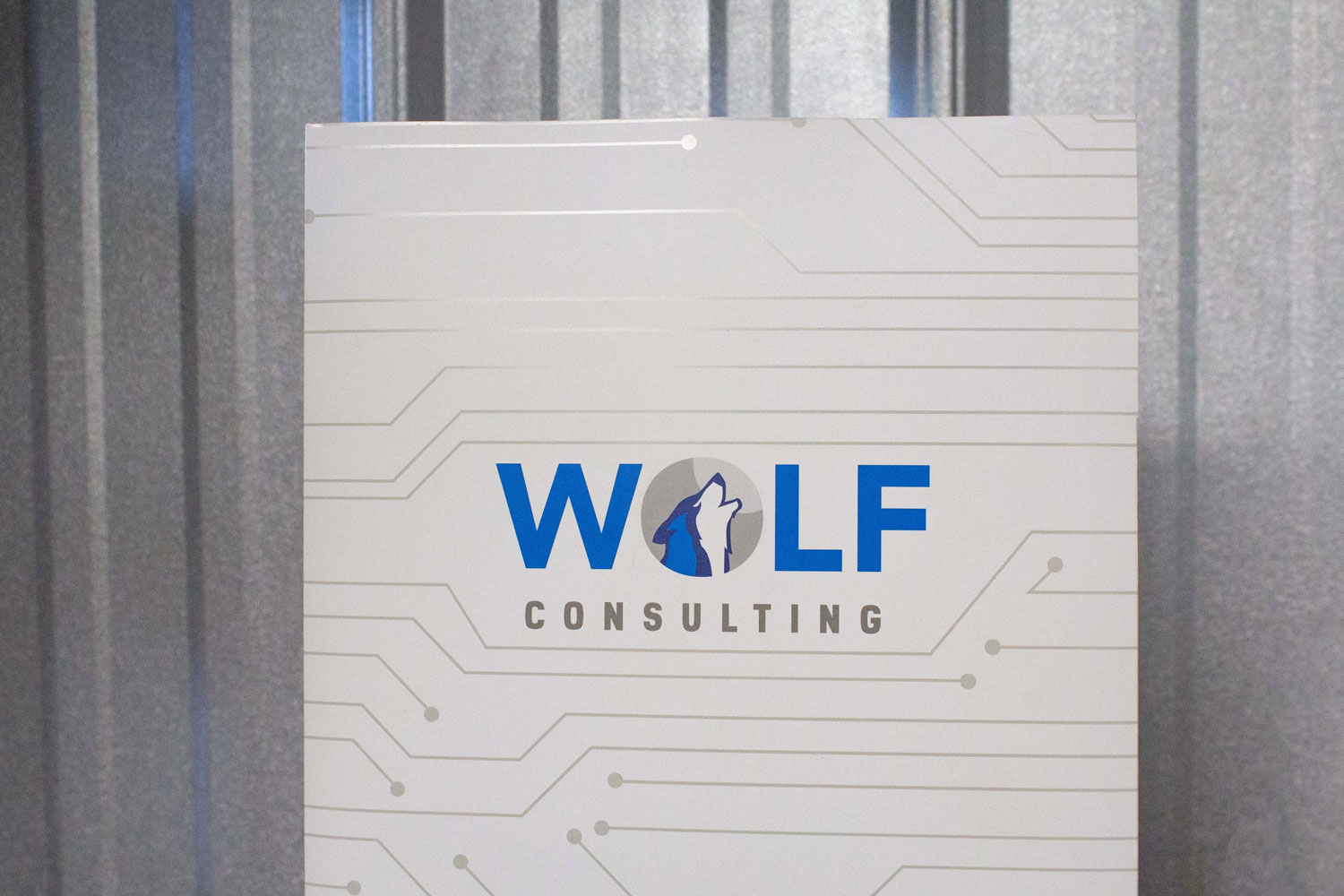
By integrating the wolf into the “O” in WOLF, the identity remains connected to the company’s history while becoming more distinctive, memorable, and adaptable across print and digital applications.
The Logo Concept
The logo represents the name Wolf with a literal wolf symbol, continuing the legacy of the original brand in a cleaner and more modern way.
THE BRAND ELEMENTS
A Cohesive and Flexible Brand System
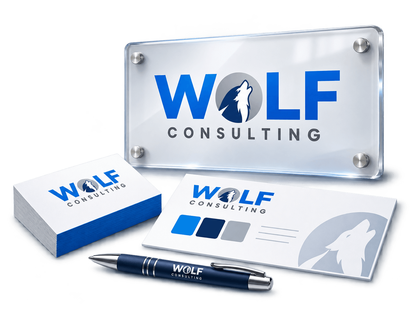
Beyond the logo itself, the brand refresh established a stronger visual system designed to create consistency across Wolf Consulting’s materials and environments. The identity was built to be practical, scalable, and easy to apply across a wide range of touchpoints. Logo Design & Branding Case Stu…
THE TOOLS
Technologies Used
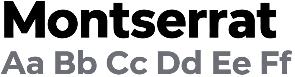
Industry-standard creative tools were used to develop the Wolf Consulting identity system and supporting brand materials.

BRAND IN ACTION
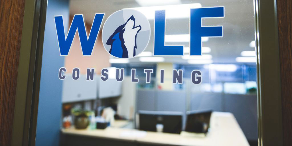
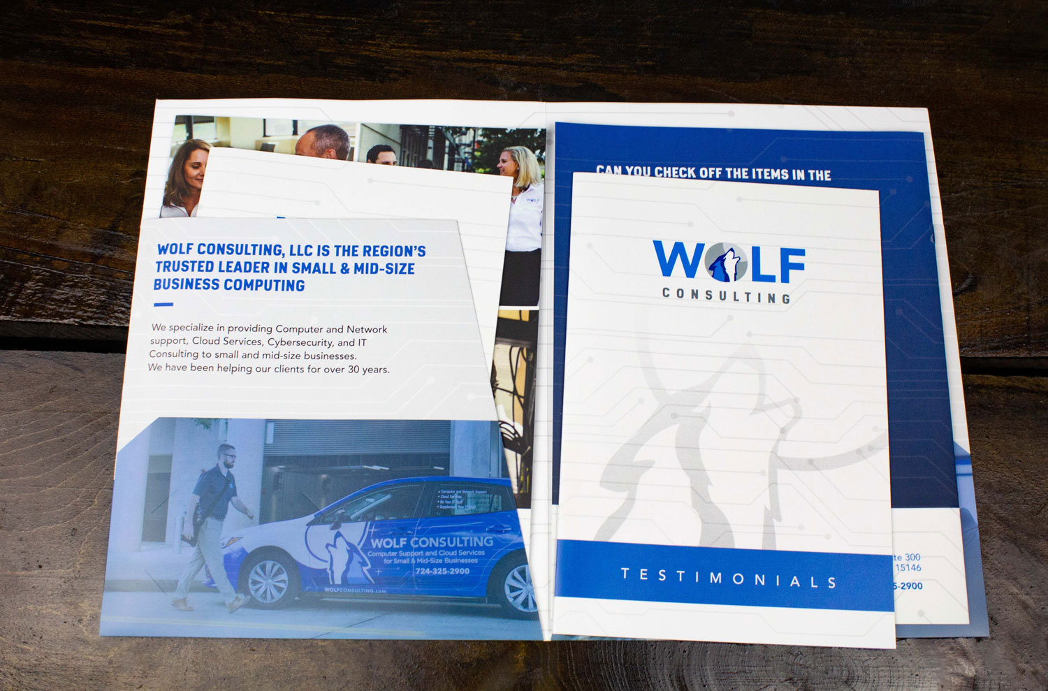
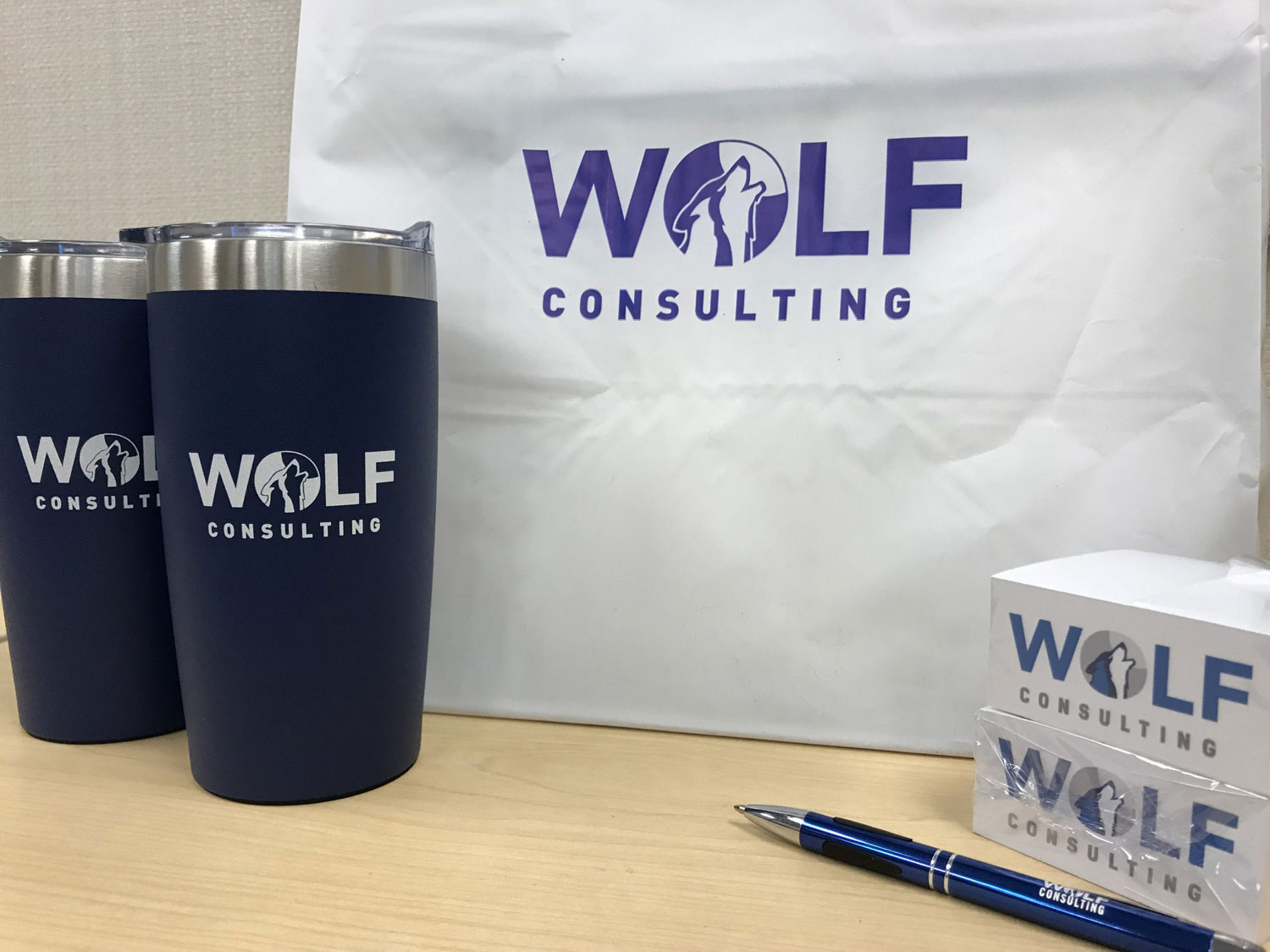
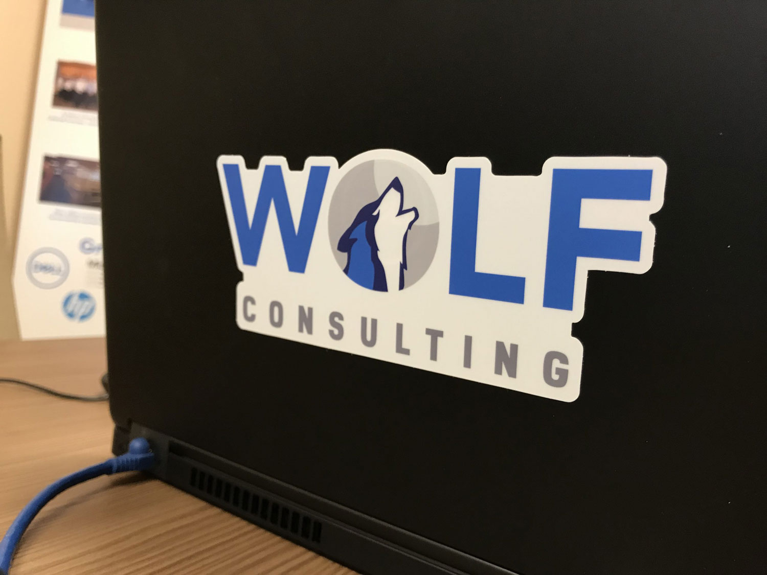
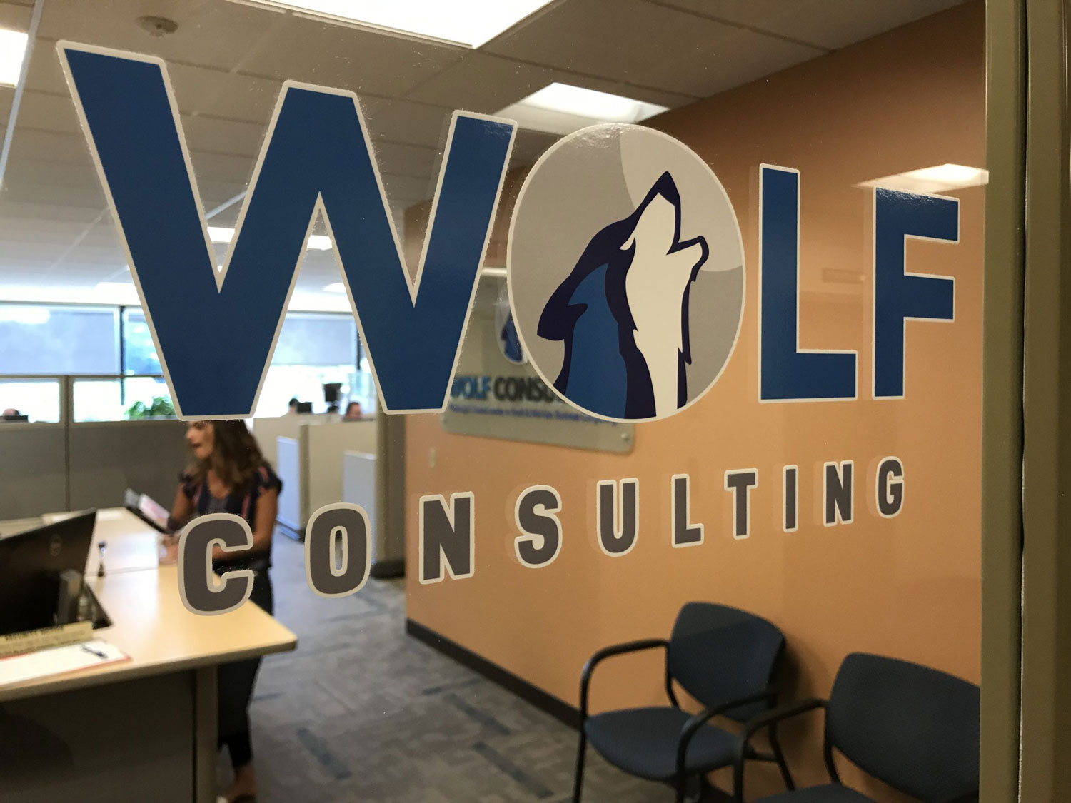
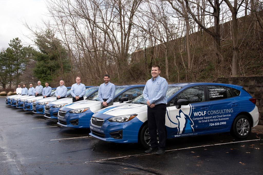
Bringing the Brand to Life Across
Real-World Touchpoints
THE RESULTS
A Refreshed Brand That Builds
Credibility and Consistency
The final identity gave Wolf Consulting a more modern and professional visual presence while preserving the familiarity of the original brand. The updated system is more flexible, more recognizable, and better suited to the range of applications the company uses every day.
Although no formal business-impact metrics were reported, the client was happy with the refreshed brand, responses were positive, and brand consistency improved across the organization.
